What do I look like? A Designer?!
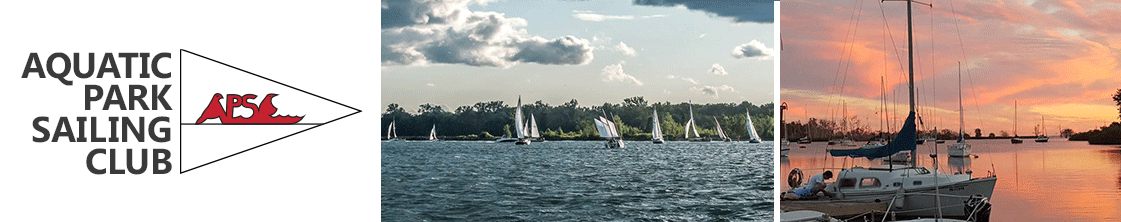
 I hope everyone had a great holiday and is looking forward to a great new year! 2016 marks Aquatic Park Sailing Club’s 40th season this summer and to help us celebrate we are moving ahead with some exciting (albeit small) changes. As we transition away from paper work-hour cards to an on-line reconciliation (bugs and demons to be exterminated and exercised this winter….) we thought it high time to introduce a plastic membership card.
Plastic won’t tear, mold or turn into a soggy mess when left under a dripping port-light. They won’t turn into a crusty wad when left in a pocket and get washed or doused. They won’t become illegible halfway through the season, are long lasting and most importantly look really cool!
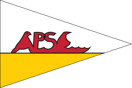
APSC Burgee
waaait a second… what’s cool? For that matter, what is our logo! Is it the sail/wave graphic on the sign and website or or is it the yellow/red bird on the burgee ?
Are we Trendy? Clever? Whimsical? Folksy? Corporate? Hipster? Ironically Tacky? Photo based? Text Based? Illustrated?
Clearly you can see I’m looking for ideas. How does the membership, (that’s you) identify with the club?
If you, or your loved ones know what Pantone is, can explain the difference between tracking an kerning, send them my way (graphic-design for work hours…..).
Additionally if you have strong feelings in any graphic direction, let me know. This is your club, your card.
Philip Krueger
Secretary
Aquatic Park Sailing Club
*The images below are designed to stimulate discussion and creative juices, not design suggestions!
![]()
**Addendum
I wasn’t proposing a new logo, so please, stop the death threats!
My post was a cry for a graphic designer to help us design our membership cards, and (perhaps extend that to the website and other materials) – the anniversary is as good a time as any to consolidate and be consistent with our image as we celebrate our club. An identity package is more than just a logo.
My apologies for a lack of clarity, my choice of logos was misleading – but please keep the email’s coming, I’m getting great feedback!
**Addendum #2
A logo and a burgee are not the same. They would/could share similar elements but are very different items and serve different purposes. To state the obvious: one is a flag, the other a multi-purpose identity graphic. Logo’s are designed to be easily reproducible in colour, gray-scale and black and white, as well as being legible when reduced in scale.
Below are some examples of how other clubs have treated burgees and logos. RCYC is a good example of having a logo and a burgee. National incorporates their burgee into the logo and also have simplified version the would lend itself to being used on a transom for example.
![]()